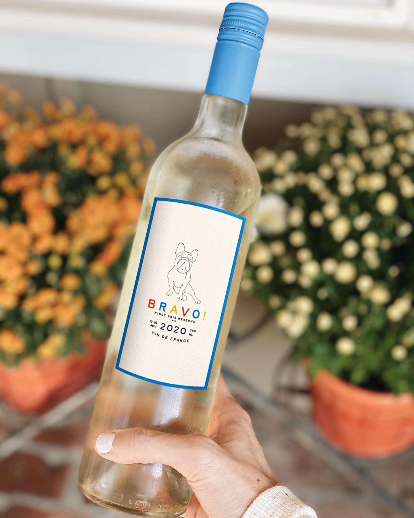
Bravo! WINES

Art Direction | Branding | Packaging


For the love of wine. For the love of self.

Bravo! is a wine brand born out of a passion for revelry, friendship, late nights, spontaneity, and celebration. We believe that a pat on the back comes in many forms that should come far more often, that’s why our wine is both accessible and distinct.

A true fête of authenticity, this collection of exceptionally easy-drinking wines has been specially crafted to bring people together, to spark joy, tears, and questionable decisions. So gather your companions from every walk and raise a glass for us. Toast to life. Celebrate one another. Bravo, mes amis.


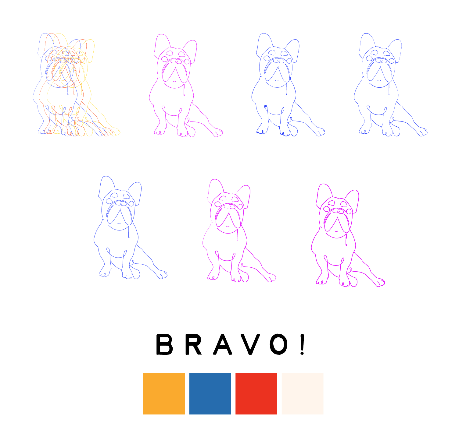
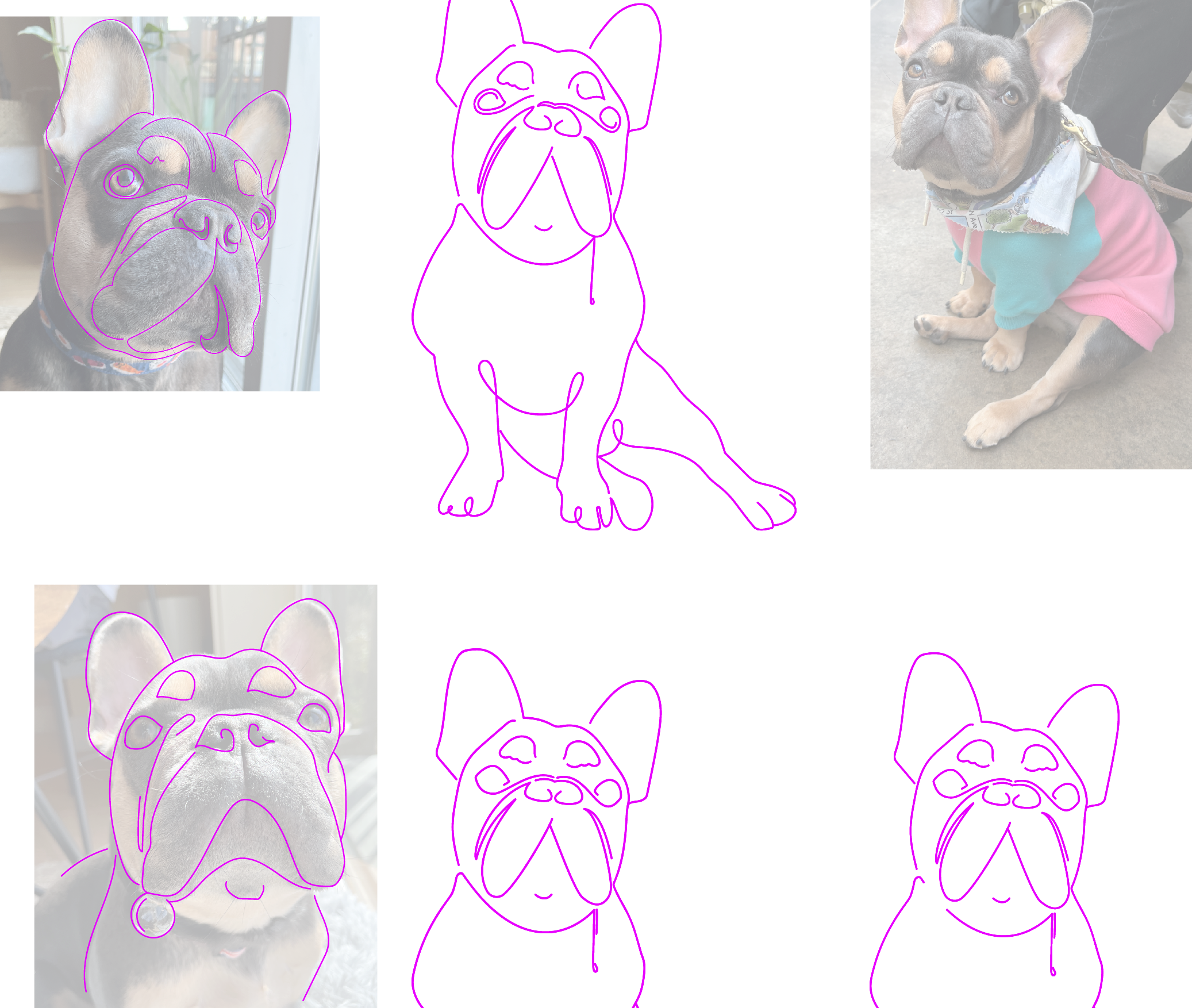
I’ll be honest — my dog is is my most trusted life companion, so I had to honor him in some way. I’ve also been known for my deep respect for the art of wine making. After a summer spent in the south of France I was inspired to bring back some of the vibrant memories of my time there and pour them into this beautiful wine label. Playful canine illustrations bring the name to life (‘Bravo’ is a common way to wish somebody congratulations in French) and create a spirited brand universe with a sense of quality and time.

The illustration is an original tracing of my French Bulldog, Digby. I wanted to create a French wine label that was modern and playful, approachable, yet evoke a sense of craftsmanship and notability.


Elston & Ada

Art Direction | Branding | Packaging


Recycled Home Goods & Kitchen Accessories

Elston & Ada is a Chicago born and raised revolutionary home goods brand dedicated to creating sustainable and stylish home goods through innovative recycling practices.

Our mission is to transform discarded materials into beautifully crafted home goods that not only enhance your living spaces but also contribute to a cleaner, greener future. By reimagining and repurposing everyday items, we breathe new life into forgotten resources, reducing waste and conserving valuable resources in the process.

Each Elston & Ada product is a testament to our commitment to sustainability and eco-consciousness. Our team of talented designers and artisans carefully handcraft every piece, ensuring meticulous attention to detail and an exceptional level of craftsmanship. From furniture to decor, kitchenware to textiles, we offer a diverse range of recycled home goods that seamlessly blend functionality, style, and environmental responsibility.

Our materials are sourced from a variety of post-consumer waste, such as reclaimed wood, discarded plastics, glass bottles, and textile scraps. By diverting these materials from landfills and repurposing them, we aim to make a positive impact on the environment while adding a unique touch to your home.


Elston & Ada is a concept brand that was born out of a love for beautiful homewares, Chicago, and the planet.

I designed all of the original logo, color palette, packaging and promotional visuals you see in this gallery and all of the copy was written by me.


LÉonie feminine cbd

Art Direction | Product Design | Packaging Design


Pure relaxation guaranteed.

The Léonie brand is soft, suave, classy and strong. Expertly crafted from just 3 ingredients, she’s the first full-spectrum CBD tincture specially formulated to ease muscle pain and many other feminine PMS symptoms. No longer do woman need to be burdened with debilitating lower back pain and increased levels of anxiety during their most crucial of life’s moments – Léonie is taken orally and works quickly to relax the body and quiet the mind.

Our product is vegan, gluten free, alcohol free, sugar free and comes in three different dosage levels – 250MG, 500MG and 750MG and two flavors, peppermint and original. Our tinctures are hemp-derived, clean, and retain the plant’s original terpenes and phytocannabinoids to deliver a strong broad spectrum formula you can actually feel.

Léonie – breathe easy and move freely. Pure relaxation guaranteed.


Léonie is a concept product I designed based off of my love for CBD. I’m a runner, a boxer and am also constantly terrorized by my own PMS. I’ve recently found solace in the use of strong topical CBD products to help me stay in the game but wish there was something on the market that felt more feminine and user-friendly.

I designed all of the original branding, packaging and promotional visuals you see in this gallery and all of the copy was written by me.


Screen Shot 2020-07-23 at 3.46.56 PM.png

Human Nation

Website Design | Work in Progress


WEB APP DESIGN – PASSION PROJECT

View the initial interactive prototype for the Human Nation website here. Human Nation was built with Invision Studio.

In this modern age, social media is no longer used simply for keeping in contact with friends from our high school days or for connecting with colleagues. Social media is a tool that generates real monetary value for brands, entrepreneurs, and those looking to expand their audience to make a profit.

In come the “Social Media Influencers” or, individuals who command an on-screen presence so vast that many companies will pay them to get their products in front of their millions of followers. “Influencer marketing” as its called uses social media users with an engaged and loyal audience to drive authentic conversation and engagement around a brand’s products and message.

However, what about those NOT looking to make a profit? Is there a way to harness the power of social media to raise money for organizations that truly need it?

I’ve designed Human Nation for this reason, as a concept to connect not-for-profit organizations with these powerful social media influencers to help spread the word about the worthy causes they are fighting for.

So now what? There are thousands of small and medium organizations all focussing on cleaning up trash or volunteering with under privileged children. How does Jane Doe, the Instagram influencer with over a million followers, choose the right organization to invest her time in (and the time of her audience)?

Imagine HuNa as a cross between a dating app and an apartment hunting app. Influencers and organizations both create their own respective accounts (each with their own personalized dashboards) with the ability to filter for what they are searching for.

Brininstool + Lynch

Website Design | Branding


CHICAGO ARCHITECTURAL FIRM

Brininstool + Lynch is an award-winning, design-focused architectural practice based in Chicago, IL. For their new website launch in late 2018, I designed several web pages for their new site with the goal to showcase their work in a simple and elegant way. Wire-framing and mockups were done using a combination of Photoshop and Adobe XD, and built using PHP on the Drupal CMS with the help of our dev team.

Almost Home Kids

Graphic Design | Print Design | Publication


MEDICAL NOT-FOR-PROFIT DIRECT MAIL/PRINT

Almost Home Kids is an organization where medically fragile children are able to make their transition from hospital to home. I have worked with Almost Home Kids on annual reports and seasonal newsletters as well as a variety of web and print materials.

almosthomekids.org

RIPT APPAREL

Graphic Design | Photography | Branding | Art Direction


ONLINE RETAILER ART DIRECTION

During my two years with RIPT Apparel, I was responsible for designing all online advertising. This includes social media banners and email marketing ad campaigns. With a business model centered around ever changing pop-culture themed sales, I became skilled at designing flexible imagery for a variety of platforms. I had to work in several realms of digital design including photography, illustration, retouching, and front-end coding. All images seen below were shot, edited, and art directed by me.

RIPT Website

Upper shot for an urban themed shoot I conducted for our parter, Unidays. Models were shot with blank tees with designs added later in editing.

Overpass shot I for Unidays advertisment. Models were shot with blank tees with designs added later in editing.

digital Advertisements (social media)

Upper shot for an urban themed shoot I conducted for our parter, Unidays. Models were shot with blank tees with designs added later in editing.

Upper shot for an urban themed shoot I conducted for our parter, Unidays. Models were shot with blank tees with designs added later in editing.

Upper shot for an urban themed shoot I conducted for our parter, Unidays. Models were shot with blank tees with designs added later in editing.

REVEL VEGAN CREAM CHEESE

Graphic Design | Photography | Art Direction


revel: verb  rev·el  \ ˈre-vəl \: To enjoy oneself in a lively and noisy way, especially with drinking and dancing.

They said we couldn't do it. Well, on top of making next-level-delicious vegan spreads, we're also pretty great at blocking out the haters. Years and countless tubs of bland and unexciting cheese spreads after our induction into the world of the dairy-free we said ENOUGH. We wanted flavor. We wanted savory and sweet; we wanted a creamy spread that wasn't afraid to break the rules!

So go ahead, pass it around, impress your friends. Spread the word just as easily as you do spoonfuls of Revel into all your favorite nooks and crannies (ha, see what we did there?).

Logo_colors-08.png
front-10511-front-2000x2000_sideview.png
typeo-10.png
 

the Velvet Pig gastropub


Graphic Design | Branding | Art Direction


RESTAURANT BRANDING

The Velvet Pig Beer and Bacon Bar was birthed in 2012 by renown gastropub restauranteur Peter Sandström, coming directly off a stint as sous chef at the Patina Restaurant Group in New York City. Wanting to combine his passions for both craft beer and exotic smoked meats, Sandström renovated an abandoned 1960's auto body shop into what would become the hottest dog-friendly watering hole in the Pilsen neighborhood of Chicago.

The shifting VP menu often sports a rotating selection of charcuterie, with the star being the mouth-watering variety of bacon present in more than half of the dishes (there's an entire menu section simply titled 'bacon' to make your decision that much easier). While satisfying the craving for this salty crispy favorite, guests can also choose from other fresh seasonal bar fare as well as peruse an entire menu customized just for your four-legged friend.

 
Screen Shot 2020-07-23 at 3.09.04 PM.png

BRAND STYLE GUIDE

 
ribs.jpg

** Interior decoration photos courtesy of greenstreetmeats.com **

Scandinavian airway systems

Graphic Design | Branding | Art Direction


SAS FULL RE-BRAND

Below is a fully revamped style guide as a concept rebrand for the airline Scandinavian Airway Systems (SAS). The publication includes guideline s for color, font, and logo usage as well as product design and photo treatment.

Black Box wine campaign

Graphic Design | Photography


BLACK BOX WINE PROMOTIONAL CAMPAIGN

This is a concept project for Black Box Wine done for an Ad Development and Design class at Columbia College. Within this project I acted as the photographer and graphic designer. The idea of the campaign was to express how portable and convenient boxed wine can be, and the luxury which Black Box Wine provides. The campaign is meant to be positioned in airports, targeting busy travelers and business men and women looking for a convenient drink after a long flight.